Pi is everywhere. It appears in circles, waves, probability distributions, and quantum mechanics. Yet calculating it precisely has challenged mathematicians for millennia. Ancient civilizations approximated it. Modern computers compute trillions of digits. But the methods themselves can be surprisingly elegant.
One such method is the Leibniz series. Gottfried Wilhelm Leibniz discovered it in 1676. The formula is simple: start with 4, subtract 4/3, add 4/5, subtract 4/7, and continue forever. Each term alternates sign and uses the next odd number. The sum converges slowly toward pi.
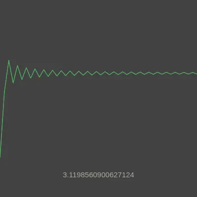
I built this project for Pi Day 2020 (March 14). The goal was to show this convergence in action. Not just as numbers, but as a visual journey. Watch the approximation oscillate above and below pi, getting closer with each iteration.
What It Does
The visualization draws a real-time line graph on an HTML Canvas. The vertical axis represents the current pi approximation. The horizontal axis tracks iterations. Every 200 milliseconds, a new term is calculated and plotted.
The line bounces dramatically at first. It overshoots pi, then undershoots, then overshoots again. Each swing gets smaller. The graph converges toward a horizontal line at the true value. The current approximation displays numerically at the bottom of the screen.
Pi Day 2020
The Leibniz Formula
The mathematical series follows a simple pattern. Each term is 4 divided by an odd number. The signs alternate: positive, negative, positive, negative. Written out, it looks like this: 4 - 4/3 + 4/5 - 4/7 + 4/9 - 4/11…
The implementation tracks three values. The running sum starts at 4 (the first term). The denominator starts at 3 and increases by 2 each iteration. The iteration count determines whether to add or subtract. Even iterations subtract. Odd iterations add.
Each calculation updates all three values and returns the new approximation. The simplicity is the point. Four lines of math produce infinite precision, given enough time.
The Visualization System
The graph renders on a 400 by 400 pixel canvas. Each new value gets stored in a history array. When plotting, the horizontal spacing adjusts based on how many values exist. Early iterations spread wide. Later iterations compress together.
The vertical scale uses a fixed ratio. The canvas height divided by 5 creates the unit spacing. Since pi is approximately 3.14, it falls naturally within the visible range. The initial value of 4 appears near the top. The convergence toward pi creates the characteristic oscillating curve.
Drawing happens in layers. First, a dark gray rectangle clears the canvas. Then the current numerical value renders as text. Finally, the historical line draws segment by segment, connecting each point to the next.
Why This Converges So Slowly
The Leibniz series is famously inefficient. After 1000 iterations, you get maybe 3 correct digits. Other algorithms reach billions of digits in the same time. But slow convergence creates better visualizations.
Fast algorithms would show instant convergence. The line would snap to pi immediately. No drama. No oscillation. The Leibniz series takes its time, letting you watch the mathematics unfold frame by frame.
This slowness also demonstrates an important concept. Infinite series can converge to precise values without ever reaching them. Each term gets you closer. No term gets you there. The visualization makes this abstract idea concrete.
Canvas Animation Loop
The animation runs on a fixed interval timer. Every 200 milliseconds, the calculation runs and the canvas redraws. This timing creates a readable pace. Fast enough to show progress. Slow enough to follow visually.
The loop contains just two operations. Calculate the next term. Plot the updated history. The shapes library handles all the drawing primitives. Lines connect data points. Rectangles clear backgrounds and display text regions.
What I Learned
Building this project reinforced several ideas about visualization and mathematics.
The Leibniz series demonstrates that simple formulas can encode profound truths. Four lines of arithmetic approximate one of nature’s most important constants. The formula’s elegance matters more than its efficiency.
Real-time visualization makes abstract concepts tangible. Watching convergence happen is different from reading about it. You see the oscillation dampen. You feel the approach toward pi.
Canvas provides enough power for many visualizations without libraries. Lines, rectangles, text, and circles handle most cases. The 2D context API is simple and fast.